B2B Explainer Video for CloudLinux: How We Turned a Complex Product Line into 90 Seconds
A brand launch explainer for two audiences, built to work with the sound off
Services
Explainer
Marketing Goal
Brand launch video
Target Audience
Hosting providers and web agencies
Project Timeline
9 weeks
Project Overview
A brand launch video for CloudLinux’s rebrand, written for two audiences at once and designed to work with the sound off.
Project at a glance
- Client: CloudLinux
- Services: scriptwriting, 2D animation, motion design, voiceover and sound design
- Timeline: 9 weeks, from briefing to final delivery
- Marketing goal: brand launch video
- Target audience: hosting providers and web agencies
The Challenge
The client. Since 2009, CloudLinux has built the software that web hosting runs on: the CloudLinux OS operating system, Imunify360 security, and tools for site performance and patching. Its products power more than 65 million websites.
The task. For the first time in 15 years, the company was changing its brand and reaching out to a new audience: web agencies. It needed a video in two independent parts:
- a short piece of about 30 seconds to reveal the new brand at the company’s event in Miami;
- a main piece of about 90 seconds for the website, built in the new brand from the first frame, with no references to the rebrand, because a new visitor doesn’t care what the logo used to look like.
The video had to keep the trust of long-time customers and say one thing clearly: everything they rely on stays, and new markets and products are being added on top. There was a second goal as well. At the briefing we learned that many customers have used one CloudLinux product for years without knowing about the rest of the line.
The challenge. We started with four positioning documents, three brands, more than a dozen products, and two audiences with different pain points. That was enough material for a ten-minute film, and we had 90 seconds. The video also had to work without sound, because on a trade show booth screen nobody hears a voiceover. We framed the task this way: instead of a tech explainer video that lists products, find one story that both a hosting provider and an agency recognize as their own.
Project Execution
How We Built the Story
Step 1. Briefing: deciding what to leave out
Before writing a single line of the script, we ran a briefing with CloudLinux’s VP of Marketing. The main question was what not to say. After the briefing, we took these out of the video:
- products in beta;
- the group’s enterprise brand;
- logos of large customers that couldn’t be shown;
- the company’s timeline.
We also set the tone right away: no fear tactics, calm and confident, a female voice with a neutral accent. We paid attention to numbers too. The video will live on the website for years, so instead of “15 years in business” the frame says “since 2009”, a figure that won’t go out of date next year.
Step 2. Finding the story: from products to three jobs
Our first idea was an elegant one: a through-line of “isolation and control”. CloudLinux isolates websites from each other, and Imunify isolates threats. At the briefing, the client corrected us: “isolation” describes one product, while security works proactively, before anything happens. Customers care about free time, not technology. Agencies want to grow their clients’ business instead of putting out fires, and hosting providers want to grow without growing their operations team.
That is where the final structure came from. We turned the product layers on the website into jobs, the work CloudLinux does for its customers:
- Fast & Stable. Sites stay fast and stable, even under load.
- Secure. Attacks are stopped before they reach a site, and the few that get through are contained and cleaned automatically.
- Patched. Patches go in live, even after a system reaches end of life, with no late-night reboots and no forced migrations.
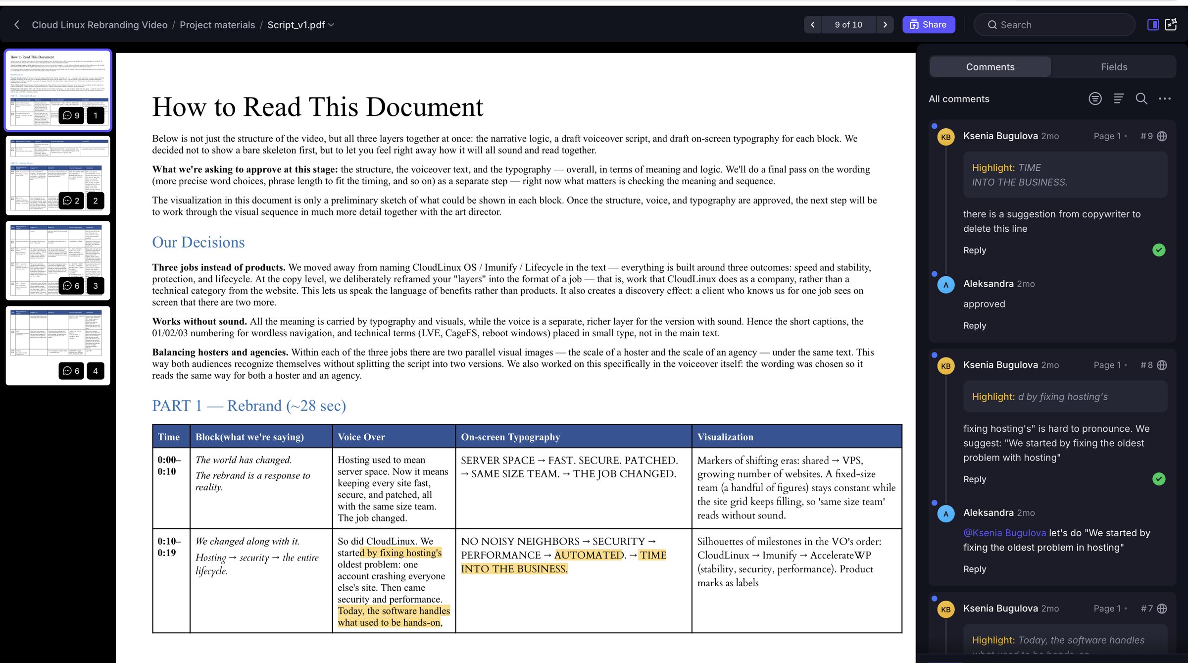
This structure solved two problems at once. The video speaks in benefits instead of product names. And it literally counts to three: a customer who knows CloudLinux for one job sees on screen that there are two more. The closing line ties it together: “Three jobs, off your hands. One platform for the websites you host or manage.”
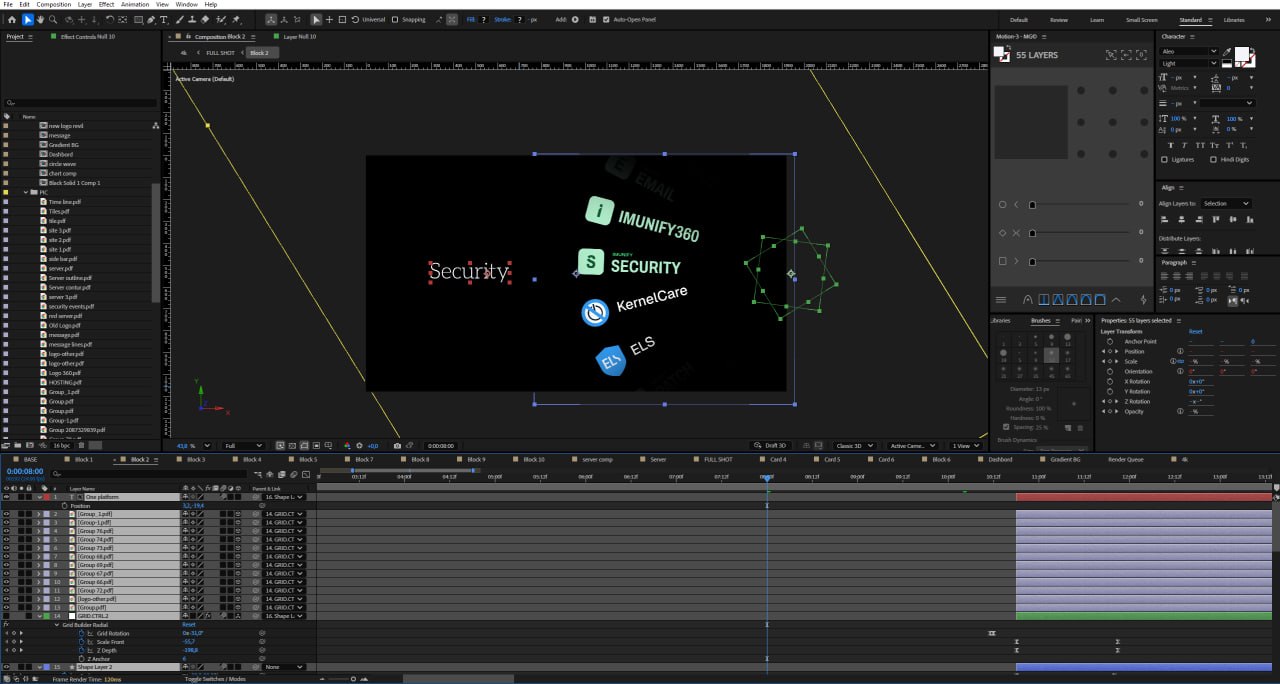
We also had to make sure each part works on its own. In the full version, the icons for the three jobs (Fast, Secure, Patched) appear at the start and come back at the end as part of the final packshot. At the clean storyboard stage, we realized that if the second part is published on its own, the icons would show up only at the end and viewers wouldn’t know where they came from. So we added a scene at the start of the second part where the icons appear again with their own animation logic. That way each part is a complete story.
Step 3. One script for two audiences
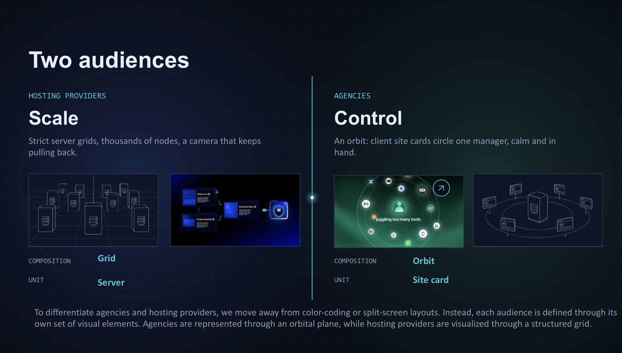
The hardest question on the project sounded simple: in each of the three jobs, what makes a hosting provider different from an agency? The answer wasn’t spelled out anywhere on the client’s old website, so we had to put it together ourselves. A hosting provider thinks in scale: hundreds of servers and growth without a bigger team. An agency is about people. As the client put it, it’s one or two people looking after a hundred client websites.
This is where you see why a project like this needs a video marketing agency and not only a production team. The client had plenty of material, but the niche is complex and technical, and an animation team handed that material as is wouldn’t know where to start.
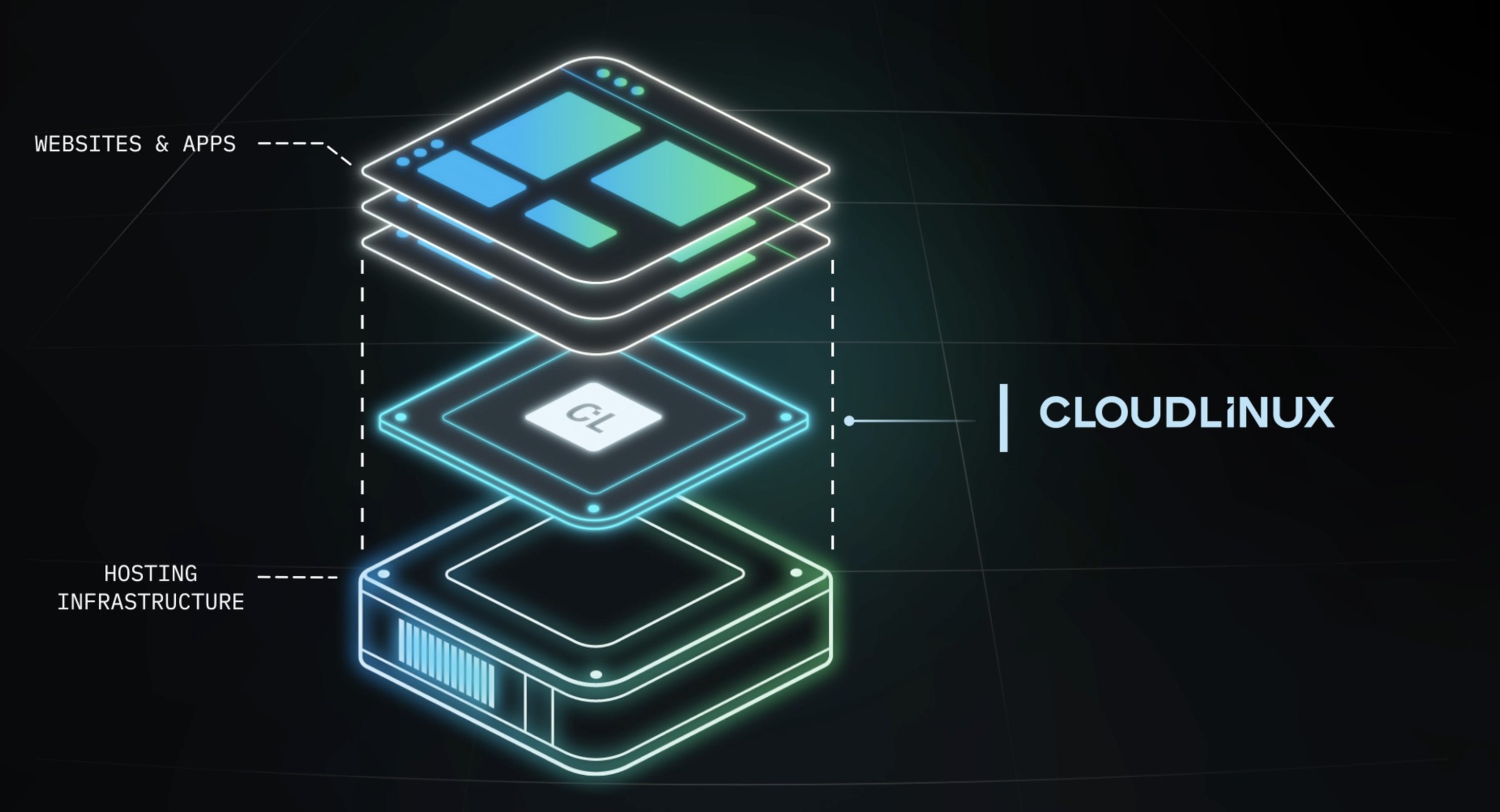
So at the script stage we first worked out how everything really works: what a server is, how a hosting provider’s server differs from an agency’s, and where exactly the client’s product fits into those processes. Then we simplified it as far as it would go, both for the script and for the team brief. In the brief, each character of the video got a single line:
- Server: hardware, a computer with basic software.
- CloudLinux: a layer on top of that basic software.
- CloudLinux products: specific add-ons, each with its own name.
The team understood the subject quickly and moved straight to the visual interpretation without getting lost in technical detail.
We decided not to split the script into two versions. In each job, the same voiceover line plays over two parallel images: the scale of a hosting provider and the scale of an agency. We wrote the voiceover in words both sides use, and avoided terms that only make sense in the world of shared hosting. Both audiences recognize themselves in the same sentence: on screen, “Sites you host” turns into “sites you manage”.
Step 4. Built to work with the sound off
Because the video had to work without sound, all of the meaning sits in typography and visuals, and the voiceover is a separate, richer layer for the website version. That is why the on-screen copy is short, the 01/02/03 numbering lets viewers follow without words, and technical terms appear in small type instead of the main text.
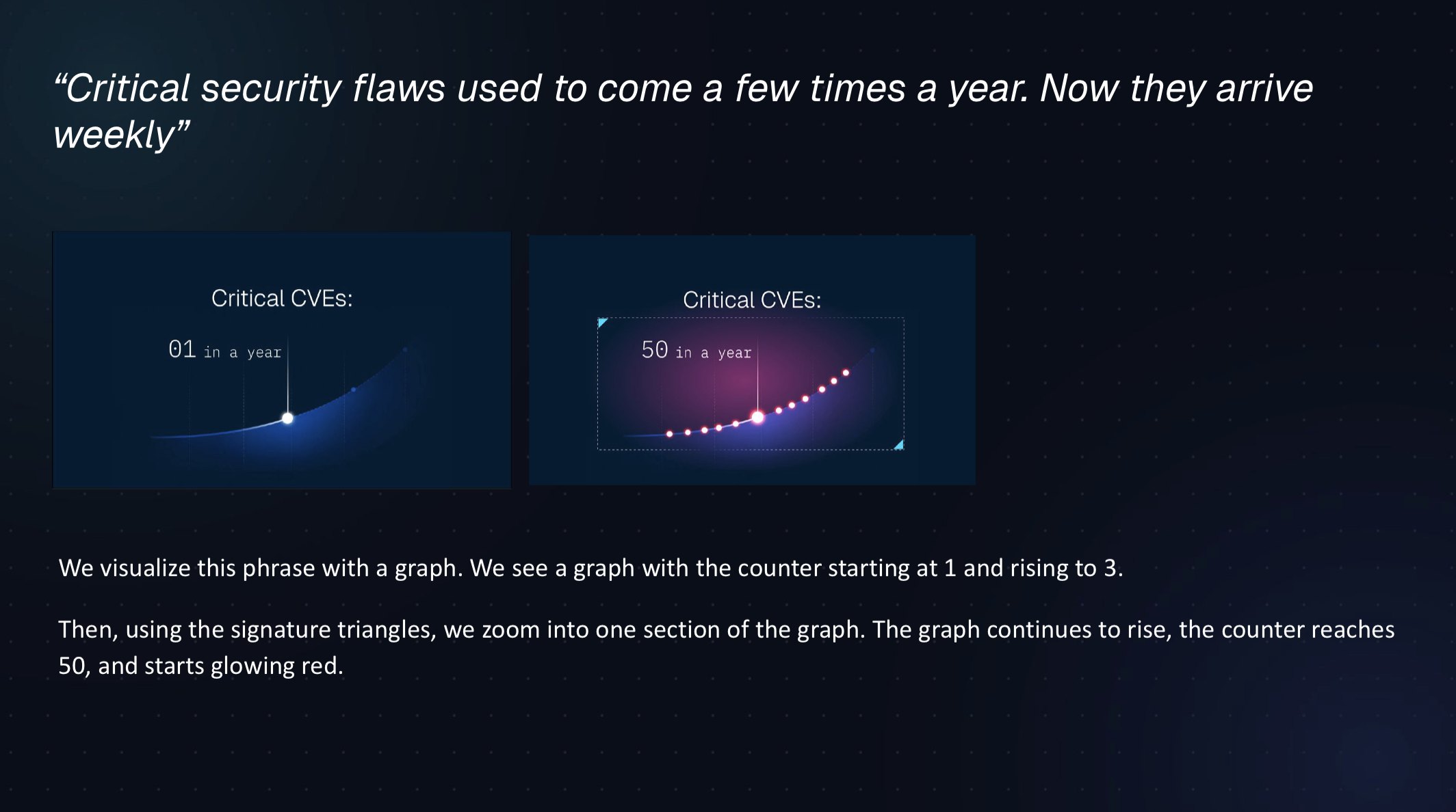
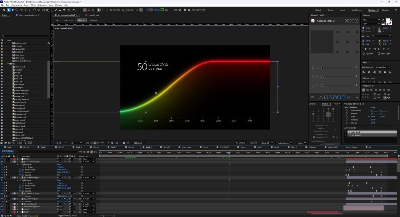
No fear tactics, with one honest fact. The rise in critical vulnerabilities (CVEs) appears only in the patching block, right next to the solution, not at the start of the video or on its own. On screen it is a chart with a counter that compares year over year.
Step 5. From script to storyboard
Getting the script approved was half the job. Next, every line had to become a frame, and lines like “keeping the software patched” stand for a big technical topic. We laid the script out as a storyboard line by line, first agreed with the client on the approach (the dot, line and triangle from the new brand identity), and only then moved on to final illustrations. Working sessions with the client’s marketing, product marketing and brand designer went frame by frame.
In parallel, we reviewed hundreds of references to see how Amazon, Intel and other players in the industry visualize technology. Inspiration was only part of it. We checked how the market is used to showing servers, layers and data, so that a professional audience reads the picture at first glance and nothing unnecessary ends up in the frame. That later helped us make illustrations and animation that are clear and quick to read.
The key decisions at this stage:
- Audiences are told apart by scale, not by color. The brand colors are already tied to products, so we showed the difference with website cards: an agency has a handful, a hosting provider has hundreds. Viewers know who the scene is about without captions or a color code.
- Real clients behind every agency. The hosting provider’s websites look generic and template-based, while the agency’s sites are all different: a bank, travel, healthcare. Viewers see right away that each agency has real businesses behind it.
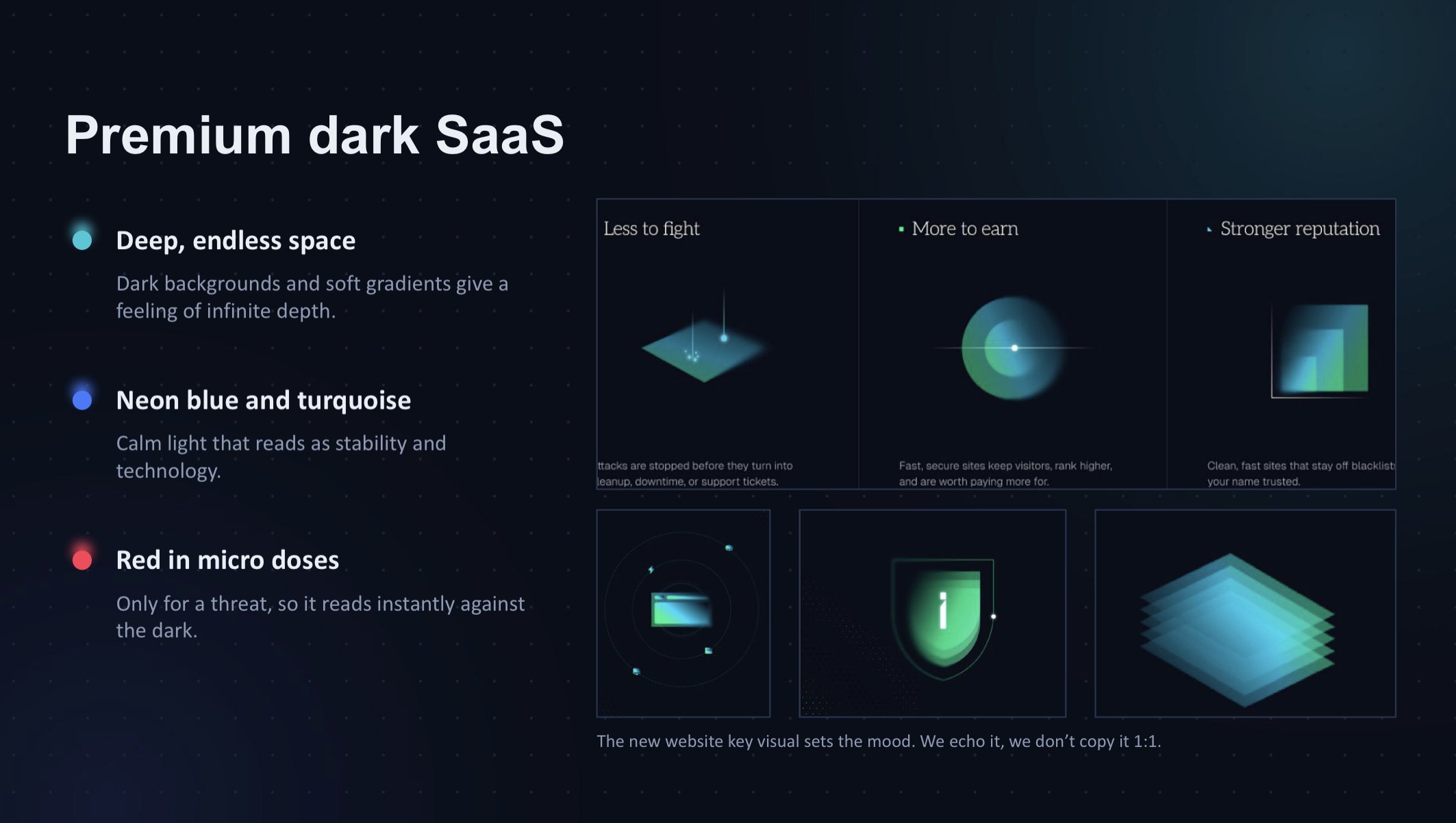
- Red only in small doses, and only for threats. Red isn’t part of the brand book, so it appears for a moment and disappears when the client’s product steps in.
- Each threat has its own image. Overload isn’t a virus. It’s one website that swells up and takes resources from its neighbors, which turn red until CloudLinux brings everything back to normal. Attacks stay in the security block, so the jobs don’t mix.
- Inside the server. In the rough storyboard, servers stood on a grid and a stream of data from many websites hit one of them. During the final illustration stage we found a better solution: the camera flies inside the server, and the viewer sees a huge stack of websites. The scale is clear at once, without arrows or streams.
- A dashboard instead of a ticket queue. The security scene originally showed a ticket queue that disappears. The client asked us to focus on the positive part of the line, “attacks show up in a report”. We drew an abstract dashboard with an incident report and a dotted map in the style of the CloudLinux website. The client’s product marketing team confirmed that the dashboard is one of the features their customers ask for most. The stack of websites flows into the dashboard with a camera move, without a cut.
- Honest about attacks. We asked the client whether we could show one attack getting through the defenses. Product marketing said yes: that is how it works in real life, and the product cleans those cases up. So on screen hundreds of attacks stop at the barrier, one gets through, and Imunify360 contains and cleans it right away. This matches the script: “We stop most attacks before they reach a site, and automatically contain and clean the rest.” Being honest here is more convincing than promising 100% protection.
- Graphics only, no stock footage. The brand has deliberately moved away from stock photos and video, and 90 seconds left no room for stock anyway. The whole video is built on the brand’s own graphics.
- Logos tied to jobs. Together with the client’s product marketing team, we mapped the products to the three blocks, and in the “One platform” scene all the product marks come together in one circle.
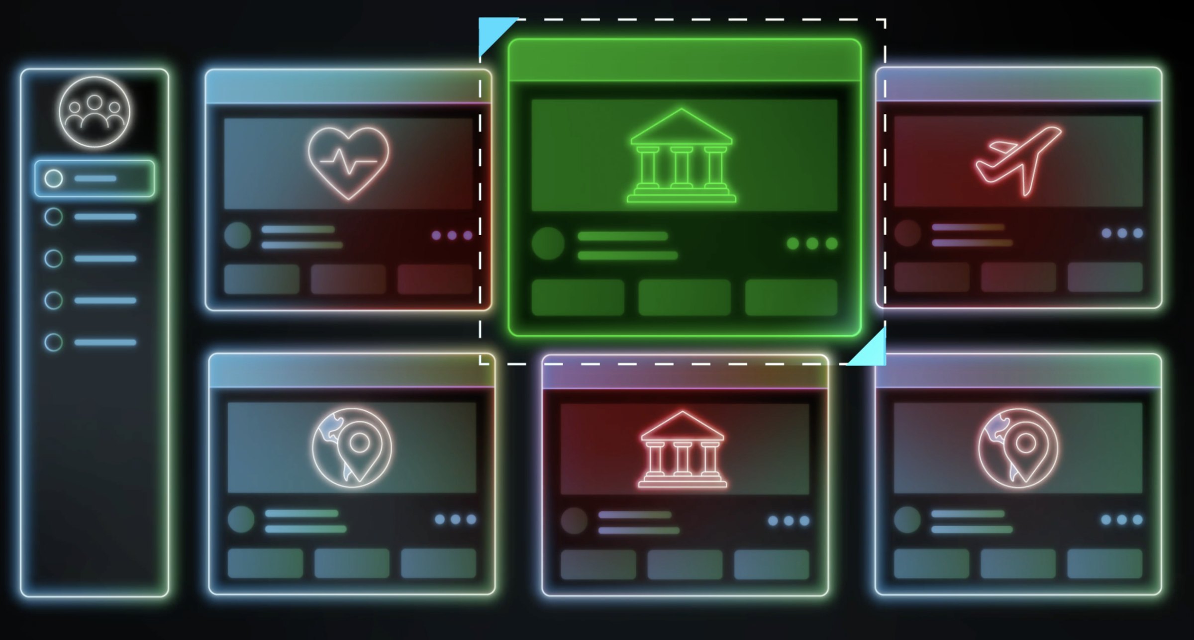
To bring dozens of scenes into one visual system, we added an art director to the team. He rebuilt the storyboard, reworked some of the scenes and set up the animation system.
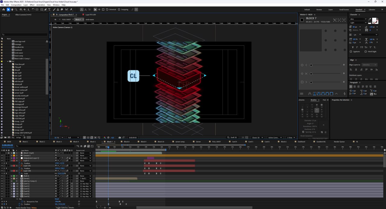
The concept changed noticeably along the way. As early as the pitch, we planned to use stock footage for cutaways and pace. The move from graphics to video was built on a line that slices the screen, and the line also connected frames and elements of the video. On paper it worked. But once the final illustrations were ready and the art director pictured the whole animation, it became clear that there were too many brand elements competing for attention, and stock footage would turn the video into visual chaos, with no room for it in 90 seconds anyway. We replaced the line with triangles and dropped stock footage completely.
The triangle from CloudLinux’s new brand identity became the center of the system. The same brand element plays several roles in the video:
- It reveals the titles. Triangles open up and reveal each title along with the information in it.
- It shows the product at work. When a problem appears on screen, for example one website taking resources from its neighbors, the problem site is outlined with a frame that has triangles on its sides. That frame signals that the client’s product is working on the site, and then the site returns to normal. The device repeats from scene to scene, so viewers read “problem, then solution” without words or sound.
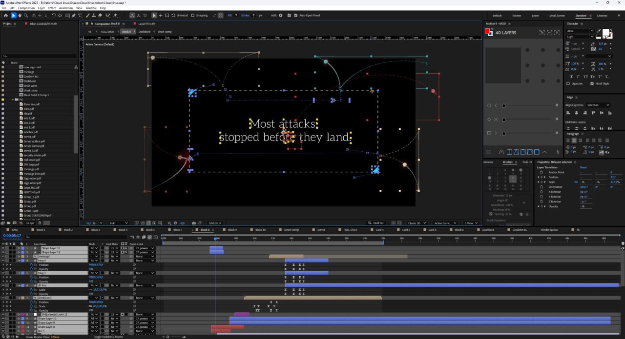
By the final style approval, we had redrawn 50 to 70% of the illustrations. During the review, the client’s brand designer told us this was exactly how he had imagined animating the triangle during the rebrand.
Visual style. The video uses a modern, tech-forward look with a focus on minimalism and a cyber aesthetic.
Animation:
- Line-based motion graphics. Interface elements, blocks and logos are drawn in with thin glowing lines, which gives the effect of a digital hologram.
- Isometry and layers. The hosting structure and servers appear as isometric 3D shapes that separate into virtual layers.
- HUD aesthetic. Icons, info cards and charts pop up and interact on an invisible grid, like a futuristic heads-up display.
Color:
- Dark background. Deep black with barely visible soft gradients creates a sense of depth, like space or a terminal screen.
- Neon base. The main graphics use bright neon shades of light blue, blue and emerald green.
- Signal accents. Bright red marks threats, system overloads and blocked cyberattacks, and only where they happen.
Step 6. Animation and sound: fitting the story into 90 seconds
Once we recorded the voiceover and added sound design, it was clear the script didn’t fit into 90 seconds. We proposed six targeted cuts that kept the key messages and didn’t move frames that were already approved. For example, “We patch live, and keep patching long past end of life. So there’s no late-night reboot to plan, and no forced migration before you’re ready” became “We patch live, even after end of life, with no late-night reboots or forced migrations.” The client approved the cuts the same day and rewrote the opening line themselves: “Now it runs itself, so you can focus on the business.”
To stay on schedule, two motion designers worked on the animation in parallel. In the final stretch, one of them took over the remaining scenes and assembled the full edit so the whole video moves at one pace. We sent scenes to the client one at a time, so feedback came in right away instead of piling up at the end.
We also worked on the pacing. The client’s brand designer asked us to avoid sharp zooms and hard stops: viewers need to follow the action instead of getting lost, like in a movie fight scene with too many cuts. We softened the ease-in and ease-out in the animation and brought static moments to life with very slow camera push-ins and a gentle drift of the layers. The frame never freezes, and it never jerks.
After the recording, the client asked to change one word: “fast and steady” to “fast and stable”. In the on-screen text that takes a minute; in the voiceover it means a new recording session. We replaced the word with AI, and in the final version it sounds like the same voice. The client picked the music from two options, one more energetic and one calmer.
Step 7. Delivering for every screen
After approval, we made a version without the voiceover. That meant more than muting a track: we shortened the pauses left for the voice and remixed the sound for the new pace. Each of the two parts was delivered in 4K for screens and in Full HD for the website and social media. A few days before the event, the specs for the screen on the yacht came in: 1920×1080, 60i, MP4. We exported both a progressive and an interlaced version, so the team on site could pick the one that looked best on that TV, much like we would prepare a trade show video for a booth screen.
Results
Results
Nine weeks passed from the briefing to final delivery. CloudLinux received:
- two independent videos: a short one for the brand reveal and a 90-second one for the website;
- each in two versions, with and without voiceover;
- each version in 4K and Full HD, plus an interlaced export for the event screen.
Project budget: about $11,000, covering the script, illustrations, animation, voiceover, sound design and all export versions.
Work on the script and storyboard took the longest, and it saved time at the finish. On the first full version, the client replied: “Let’s keep going. No other feedback.” After that, only small notes were left: one word in the voiceover, an apostrophe in a title, and more varied names on the cursors. Every question about meaning had been settled on paper.
A complex line of more than a dozen products fit into three clear jobs. Hosting providers and agencies both recognize themselves in one video. At the event, the video reads without sound, and on the website the voiceover adds another layer of meaning.
Client testimonial
“Lava Media took our quite elaborate product portfolio and turned it into a 90-second story that both hosting providers and agencies recognize themselves in. Before writing a single line, the team dug into how our products actually work, so every round of feedback was about details, not direction. The video looks great. Amazing work on such a tight timeline!”
Aleksandra Mitroshkina, VP of Marketing, Hosting, CloudLinux
Need a B2B explainer video for a complex product?
If your product is hard to explain in a sentence, that is the kind of project we like most. Lava Media handles B2B and SaaS video production from strategy and script to 2D animation and sound, whether you need an animated explainer video, brand video production for a launch, or video for FinTech and cybersecurity products. Request a quote and tell us about your product.
Related reading
- SaaS Video Ads That Convert: What Actually Makes Them Work
- How to Make a SaaS Product Video with AI, Step by Step
- SaaS explainer video case study: a custom animated explainer for B2B sales